FERRIS CAPITAL
A brand built to win
Ferris Capital transformed the entirety of Wall Street’s wealth management model and replaced it with a team that exists for one single reason: to help their clients win. There is no second place. The firm’s desire to compete and win—and to do so on behalf of their clients—gave birth to a style of wealth management the Grove team would later name and package as “Full Contact Wealth Management.” To say this team runs through brick walls would be taking the easy way out. These people get impossible things done. Period. We set out to do the same.
WHAT WE DID:
Research
Strategy
Purpose
Identity
Logo
Tagline
Messaging
Website
Collateral
We began by refining the logo. The new icon is a bar chart depicting growth as well as an F that emphasizes the firm’s aggressive leadership stance.
Ferris’ desire to compete and win—and to do so for his clients—gave birth to a style of wealth management Grove named and repackaged as “Full Contact Wealth Management.”
The strategy came straight from the horse’s mouth. It was born of Dave Ferris’ bold ambition to win. To win by working harder, knowing the right people, being smarter, being aggressively hands-on, by being busier, by wanting it more, by being more active, more determined, more intimate… We win because we take nothing for granted and leave nothing on the table. Enriched by classic finance stylings like the Wall Street Journal’s iconic type and woodcut illustrations, the identity was then given a neon wash to create a new visual language unique to Ferris—a system that was both classic and modern.

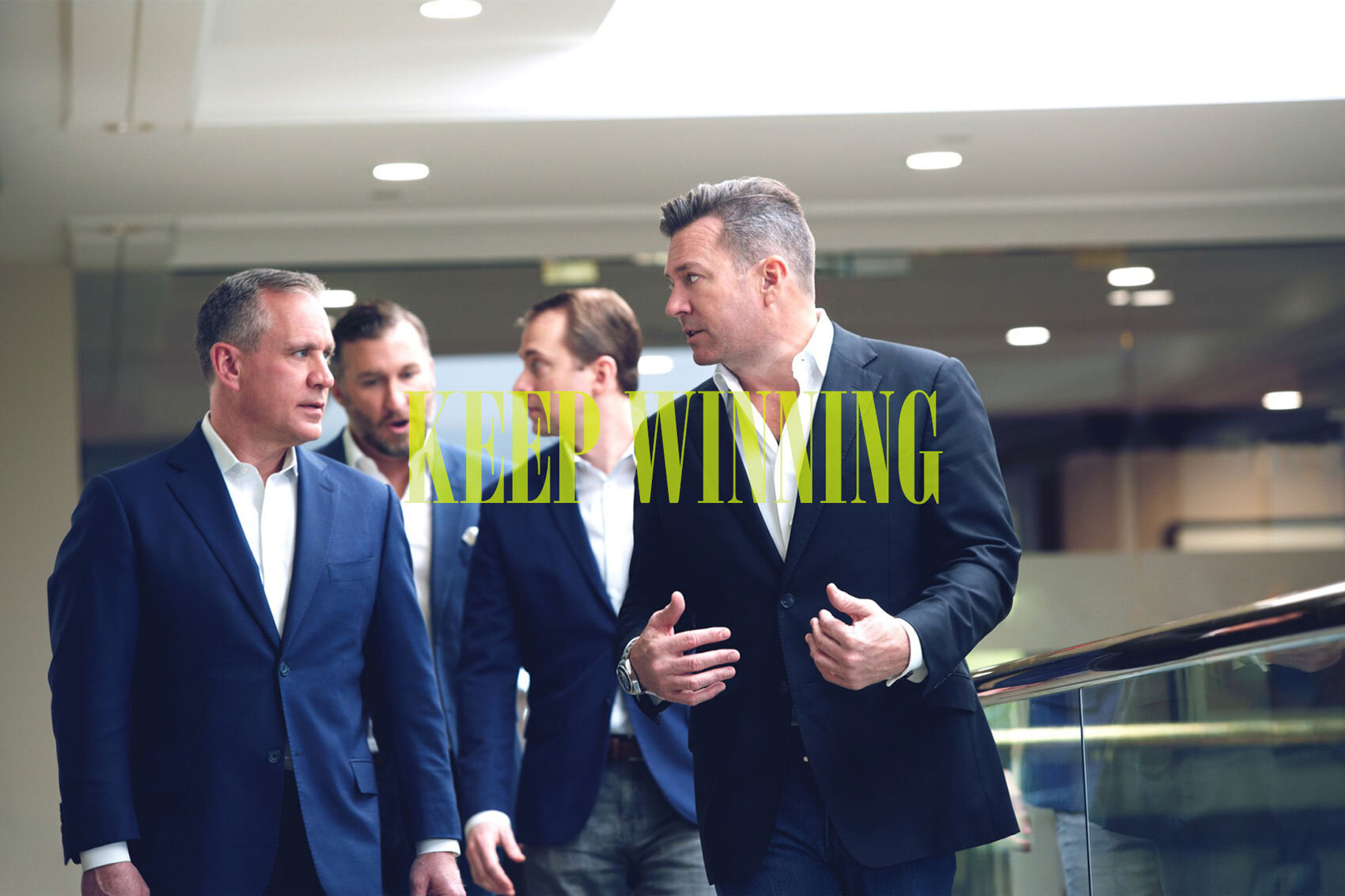
Keep Winning™ became the manifesto, the tagline and the rallying cry. Messaging highlights the needs, opportunities, goals and challenges of HNW clients. The site feels nothing like the stuffy world of wealth managers with whom Ferris Capital competes.
The bright, contemporary palette creates ample opportunity for impact, contrast, energy and excitement and works equally well in digital, print, signage and/or apparel.


